Let's Bring Webrings Back
What if a 20-year-old concept held the key to revitalizing design blogging?
I'm sure you know the feeling. You've just hit publish on a new blog post, or maybe you've just deployed your new side project. It should be a happy moment, but then a wave of anxiety hits you: what if nobody sees it?
This is then followed by a frantic effort to submit your work to all the right places, hoping that the Reddit gods receive your offering favorably, or that the popular Twitter kids bestow their retweets upon you.
This sucks, and this suckiness is exactly why Sidebar exists: to give a place where designers can submit their content and ensure it will be reviewed by an actual human and not just fed into an algorithm.
But Sidebar is by design limited. With only five featured links a day, giving everybody the exposure they need can be hard. Which is where the Sidebar Webring comes in.
Web… rings?
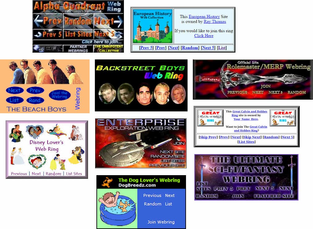
You might remember webrings if you were around for the early days of the web. Before Google could help you find any info you need in seconds, the web needed ways to organize all that information and webrings was one of them.

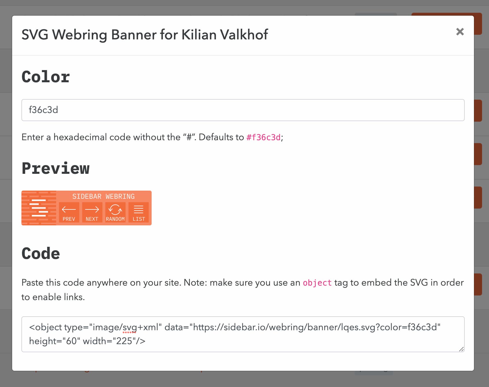
Webring were groupings of sites related to a certain topic, but in addition to being featured in a central directory, they also crucially sported banners that would let you navigate horizontally between each webring member.
You could spend hours clicking through from one site to the next, discovering more and more information about your favorite video game or band. It was the YouTube Suggested Video of its time, but without the part where it suggests Flat Earth videos (people still believed the Earth was round back then, if you can believe it!).
If you don't remember webrings (or more realistically, weren't even around for them) don't feel bad: I had to ask friends to help me remember the word “webring” itself!
The Medium Black Hole
This brings me to the Sidebar Webring. It's a reaction to two trends I've been noticing lately in the design community.
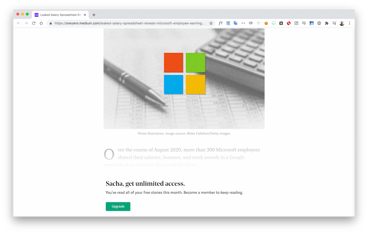
First, more and more content is migrating to centralized blogging platforms like Medium. I was originally a big fan of Medium but I've started to be a bit more critical since they've moved to put so much of their content behind a paywall. Now I get the reason why: if you want to make a living as a writer online, you do need to find a way to charge for content somehow.

But in the design community, most of us don't write to make a living. We write to put our ideas out there, to generate a discussion, or just to raise our own profile. And I'm not sure Medium is still the right platform for that.
What's more, by being so successful Medium acts like a black hole of sorts, syphoning off content that would've otherwise appeared on personal sites and blogs because writers get the impression that being on Medium is the only way to be seen.
The Fall of Design Communities
The other trend that saddens me is the decline of design communities like Designer News. It was never comparable to its big brother Hacker News in terms of traffic or discussion volume, but it was at least a reliable source of high-quality articles and interesting project submissions.
Now, it's become overrun with corporate blogspam and generates very little engagement from the community. As I'm writing this, the current Designer News homepage has only 9 comments… total! (across 25 posts)
It's sadly becoming harder and harder to pick out the genuinely unique projects and posts from the endless “5 Fresh Design Trends for 2020” cookie-cutter drivel (hint: "Big Typography" is contractually obliged to be one of them), and that is bound to hurt Designer News' ability to highlight good content.
Webrings to the Rescue
I think webrings can potentially be a solution to both issues.
The central webring homepage can act as a directory of interesting design blogs, and by aggregating RSS feeds (which thankfully most blogs still have!) it can also highlight each site's most recent content.
Because the webring is baked into Sidebar, it also makes it much easier for me to notice webring articles and feature them in Sidebar (every webring post automatically gets submitted to the Sidebar link queue).

And thanks to webring banners, popular webring members can send on traffic to more niche sites, encouraging readers to discover new voices.
A New Life For Webrings?
One of the really great things about a platform like Patreon is that it can help creators avoid being "held hostage" by a single platform like YouTube: instead of putting all your eggs in one basket, you at least split off your financial support system into a different service.
Similarly, I believe webrings could provide an alternative to Medium for writers. For example, what if a webring had a paid tier for readers, with profits being redistributed to all webring members… while letting them write on their own sites?
This is still very far away of course, but it's certainly interesting to think about.
For now, just go check out the Sidebar Webring and maybe download the OPML file so you can subscribe to all feeds at once.
And if you're curious about building your own webring, the entire Sidebar codebase is available on GitHub, including the webring feature. I also recorded a screencast about the webring feature specifically, if you want to see how that works.
Or hey, if you write about design, why not apply to join? Let's bring webrings back together!

